ESPN blogs put out a fun piece showing a bunch of the teams’ new BP caps! Of course they offer their opinions of all the new toppers (some of which I agree with and some not so much) but you should really give it a read anyway.
But to grab you the part us Twins fans are interested in, here’s a snip:
Twins (home)
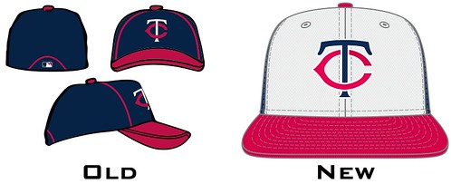
The white front panel makes sense for the Twins, because they’ve worn that style before as a batting helmet. They’re also adding a road design, which seems like a bit much. Like, the Twins, of all teams, really need separate home and road BP caps? Grades: A (home) and B- (road)
My personal fav of the new ones is the Rockies – I really like some of the more graphic additions as long as they aren’t too busy because I’m really rather conservative about my caps. That shows in the fact that I think the Rangers and the Diamondbacks also did a good job… and yep, I still hate the Marlins. Wow, that is some crap coloring they have to work with and well, everything. It has no saving graces whatsoever.
At any rate, you should check them out if you’re sitting somewhere looking out at more snow to shovel and ponder warmer days.. it’s therapeutic. Now where is my “sun” lamp…